|
For this portion of the project, I was asked to make 3 variations of the logos I chose to use as the final logo design. I organized them into 3x3 grid and made variations of them. variations can include different colors or different positions of the logo. One of the most frustrating challenges I had to face was to make ideas for the variations I needed to make and thinking about how I should make these different from each other. My favorite part of this project can be the part when we trace the logos with the pen tool and to add colors to these different variations. Overall, I learned that you need to put efforts into your project and that even though you might be a little lazy doing it but at the end when you look at the final product, it will look pretty good. 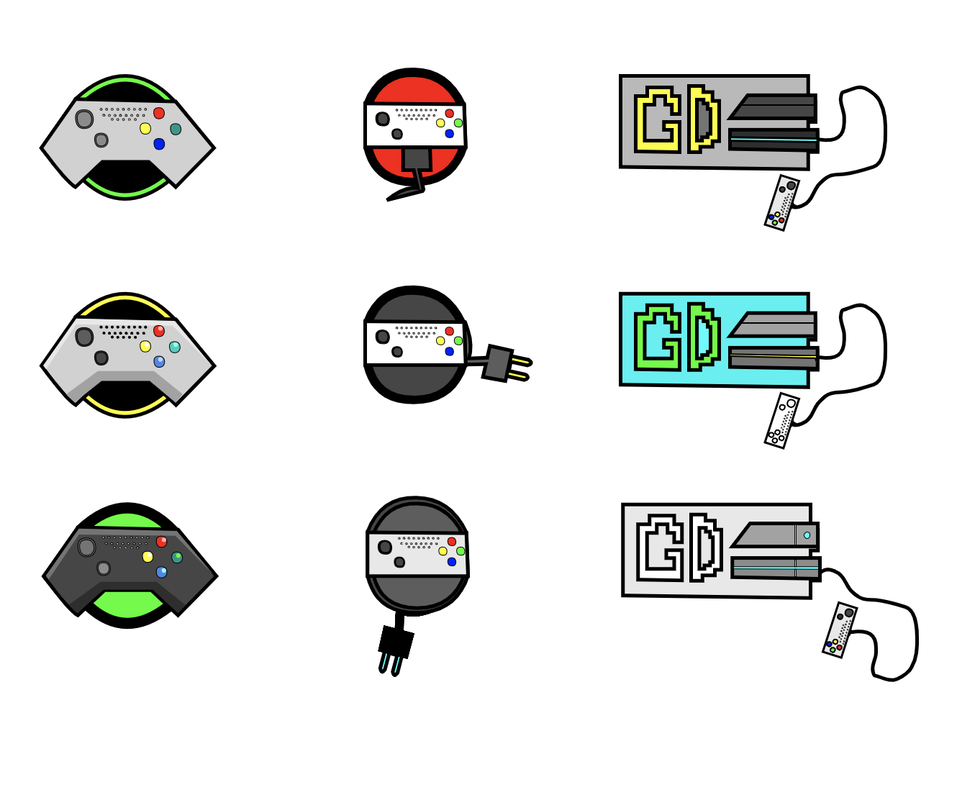  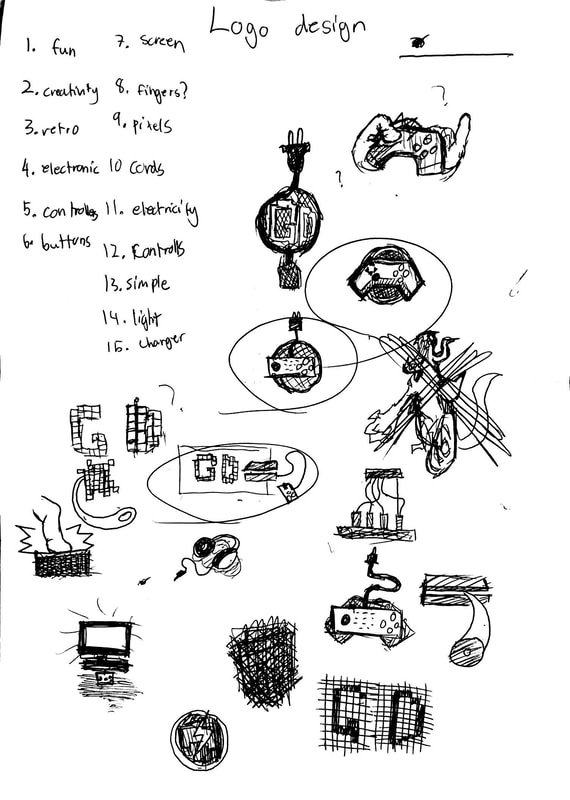 The logos I chose for my final designs were the circled ones on the top. These logos represent the company or the idea I am going to put in my design and they represent games or products related to that. The ones I like were the circled ones and also the top right one where the fingers smack the controller. But the design I did not like was the one with the giant monster. I thought this design or concept was out of topic and had to cancel that out. I liked this project because we got to design the logos with our own and also took a break from using electronics.
The hardest process was maybe the part we had to come up with words that represent the logos or ideas. For this assignment, we were assigned to make shapes that have colors from the four color schemes. These include Monochromatic, Analogous, Complementary, and Triadic. To get these colors easily, we used a website called Adobe Color to find the color easily. Monochromatic color scheme is a scheme that has one hue of a color and has various brightness of one color. Analogous scheme includes colors that are beside each other in a color wheel. Complementary combines colors from opposite sides and lastly, triadic combines 3 shades that are evenly spaced on a color wheel. For me, I like the Monochromatic color scheme because the colors are in the same category and also you can see the different shades and brightness of a color. 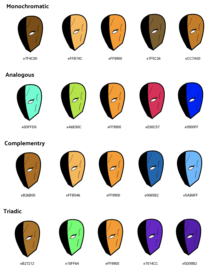 In this assignment, we were asked to make shapes or an artwork and add 16 or more colors to it. But also we had to put the RGB code of the color and also the hexadecimal code beside or below the shape so we can resemble or show what makes colors in digital things. The method I used to create the shapes is to use the pen tools in a website called Gravit. i used the pen tools to create lines and curved lines and connecting them to make them in one shape. The challenges I faced while doing this activity was that there was some times I needed to start again on some shapes because I messed some shapes up. The last shape I guess is based on a game character from a game and I thought it would be fun for me to draw this with pen tools. But I did not trace the shape. 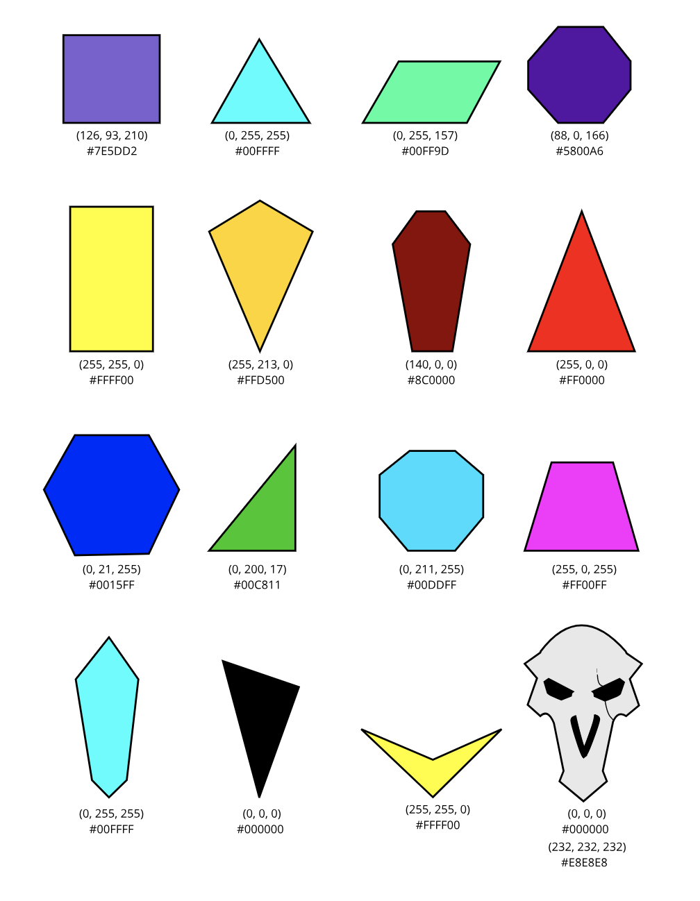 To the page i used to draw the last shape: link.
The meaning or the definition of typography is the visuals of a word or a font. Typography can be really important because typography can express the meaning or the emotion behind the text or a word. For example, when you write something about happiness, then you would want to use a font that includes fonts that look very cheerful or great instead of fonts that look straight or gloomy. Typography can be also important because some words cannot be read when used with a font with complicated writing. And when we use it in inappropriate situations, then things might be confusion and wrong. The quote "Each font has a different personality and a purpose" mean that every font can be explained as how fonts can change the perspective of a writing or a word. To top it off, a serif font is a font that has a I guess part that holds the letters. They are used in words that are more professional and serious. sans serif fonts are fonts that are generically round-looking fonts. These fonts can be used in words that are more cheerful and light hearted. Monospaced fonts are fonts that have the same space with in each letters. These fonts can be used in words that do not need large bodies of texts. Script or handwritten fonts are fonts that look like a person or an individual wrote in a paper. These fonts can be used in places that shows that a person wrote this. Finally, novelty fonts are fonts with decorations with them. These fonts can be used in parties or celebrations because they seem to stand out in many places. Typeface ComparisonIn this activity, we got to learn how different fonts work and how they an change the feeling or the look of a word. In this activity, I chose a phrase and used fonts that represents the 5 font types I listed previously to show what fonts can truly can do. 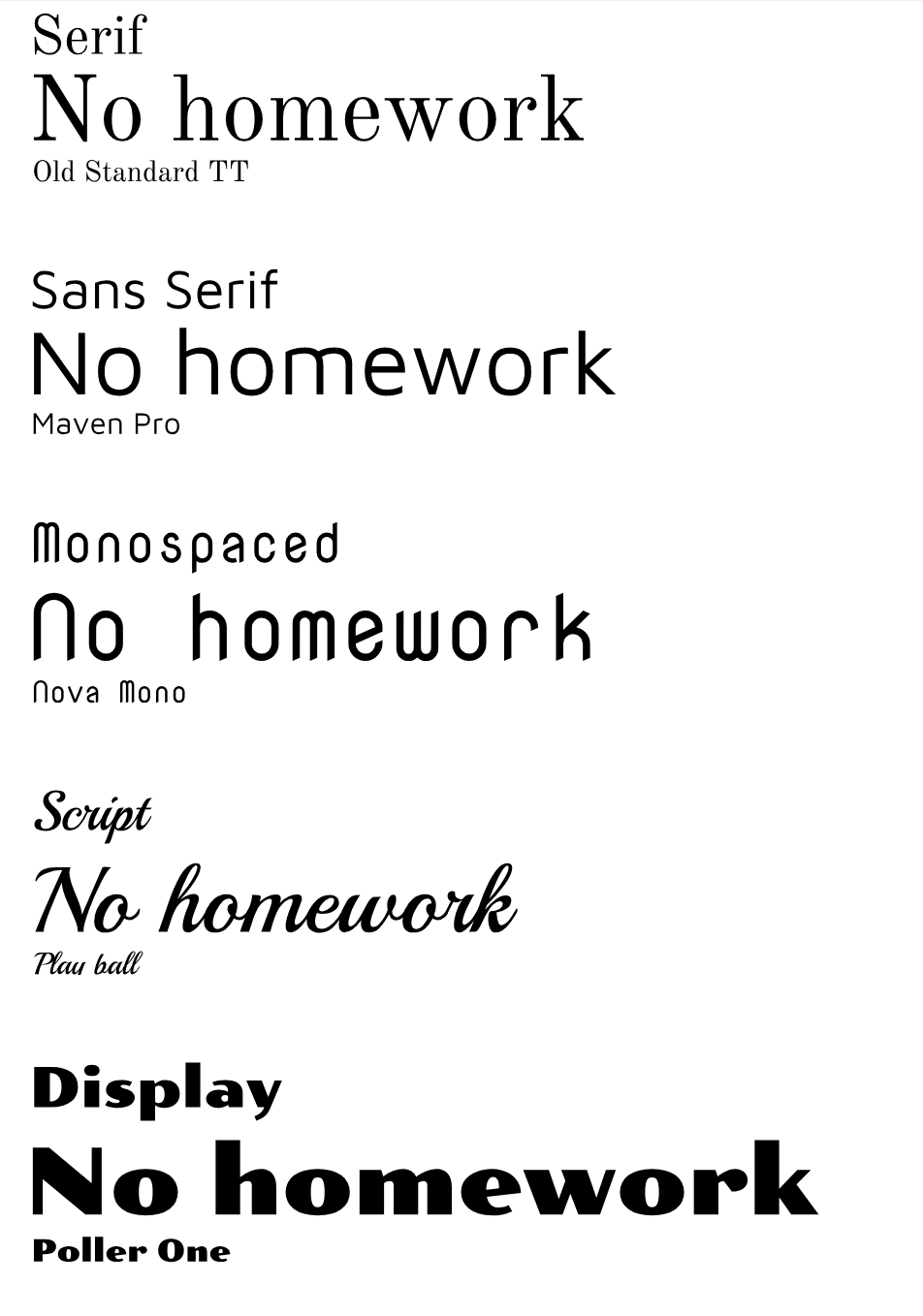 Word PortraitsIn word portraits activity, we got to learn what font fits each word and what fonts do not fit in some of these words. Through this activity, we got to see what fonts can help us know the feeling or the meaning of these words. 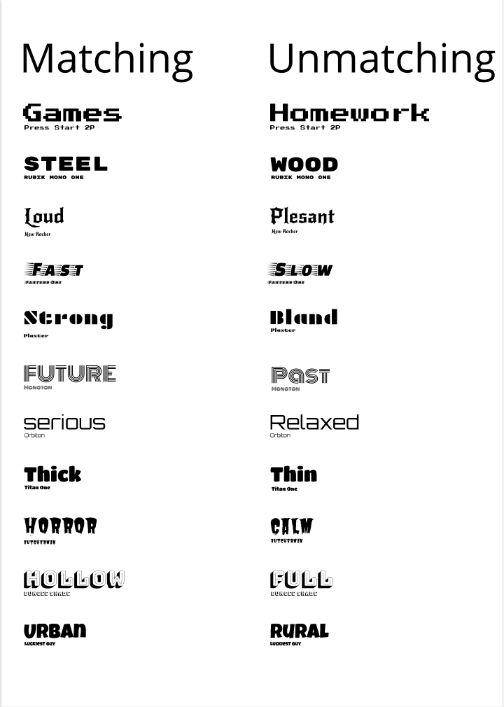 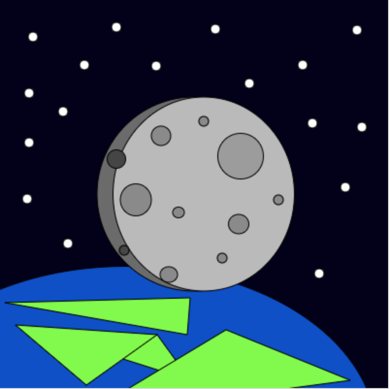 Code Used:
background(4, 0, 26); fill(0, 76, 207); ellipse(130,449,516,349); fill(107, 107, 107); ellipse(200,200,200,200); fill(186, 186, 186); ellipse(210,200,187,200); fill(156, 156, 156); ellipse(248,161,47,47); fill(138, 138, 138); ellipse(140,206,32,33); fill(138, 138, 138); ellipse(174,283,18,16); fill(138, 138, 138); ellipse(166,140,20,20); fill(138, 138, 138); ellipse(246,231,21,20); fill(138, 138, 138); ellipse(184,219,12,11); fill(138, 138, 138); ellipse(229,266,10,10); fill(69, 69, 69); ellipse(120,164,19,19); fill(71, 71, 71); ellipse(128,258,10,10); fill(138, 138, 138); ellipse(287,206,10,10); fill(138, 138, 138); ellipse(210,125,10,10); fill(255, 255, 255); ellipse(34,38,10,10); fill(255, 255, 255); ellipse(65,115,10,10); fill(255, 255, 255); ellipse(87,67,10,10); fill(255, 255, 255); ellipse(373,131,10,10); fill(255, 255, 255); ellipse(312,67,10,10); fill(255, 255, 255); ellipse(257,86,10,10); fill(255, 255, 255); ellipse(322,127,10,10); fill(255, 255, 255); ellipse(70,251,10,10); fill(255, 255, 255); ellipse(161,68,10,10); fill(255, 255, 255); ellipse(30,147,10,10); fill(255, 255, 255); ellipse(356,193,10,10); fill(255, 255, 255); ellipse(30,96,10,10); fill(255, 255, 255); ellipse(329,282,10,10); fill(255, 255, 255); ellipse(120,28,10,10); fill(255, 255, 255); ellipse(28,205,10,10); fill(255, 255, 255); ellipse(368,31,10,10); fill(255, 255, 255); ellipse(222,30,10,10); fill(64, 255, 0); triangle(196,392,89,358,162,345); fill(64, 255, 0); triangle(361,392,85,429,233,340); fill(64, 255, 0); triangle(196,307,5,312,193,345); fill(64, 255, 0); triangle(16,335,89,397,162,345); I made this art work by using a kahn academy and through this, I learned how to code through this activity and how to create shapes to make an image. I also learned how numbers in programs represent a shape or a function in an app and probably made the perspective of apps more interesting and kinda complicated. In the image above, I made a moon above the earth, floating out around the big planet. Around it, I put small, white circles around it to represent stars. I also made the lands simpler and thats why it looks deformed. Overall it was a good experience and it taught me how to code more better in many ways. |
Archives
April 2019
Categories
All
 This work is licensed under a Creative Commons Attribution-NonCommercial-NoDerivatives 4.0 International License. |